Hello there! I'm Lisa,
a visual and interaction designer. I love making beautiful, accessible interfaces that encourage discovery and make users happy.
Read a case study
a visual and interaction designer. I love making beautiful, accessible interfaces that encourage discovery and make users happy.
Read a case studyChemex is worth the wait.
I have so many pics of fish!
My favorite game right now is Dots.
Pt. Reyes is amazing.
I throw a pie party every year!
I love a good saison.
Visual, Branding, iOS
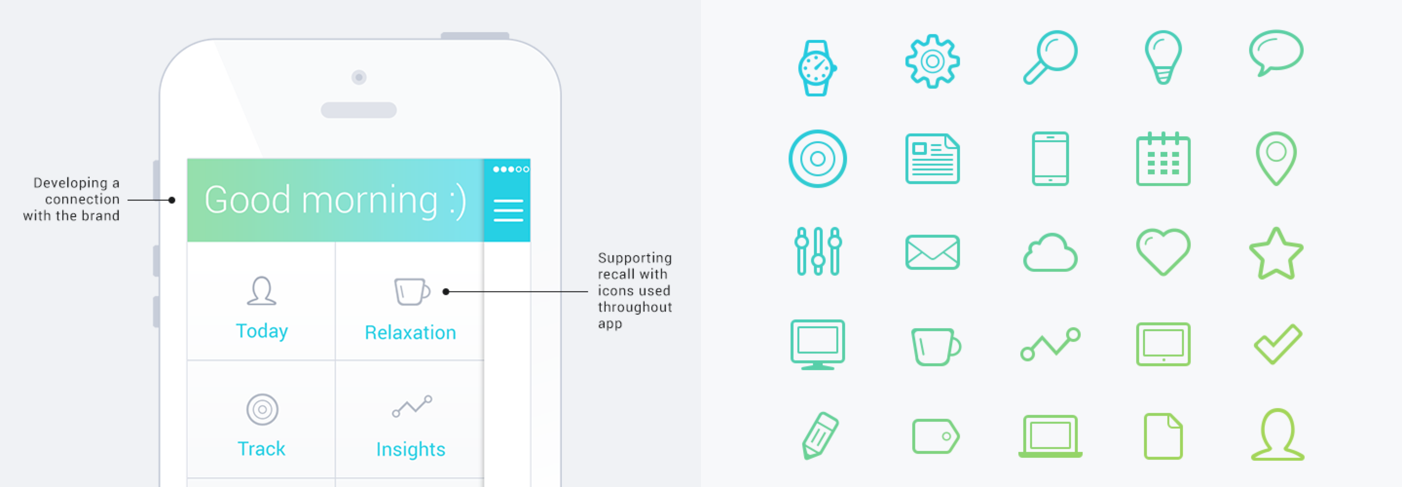
I really enjoyed working with the mental health startup ThriveOn to extend their brand and visual language. I worked with their team to do a brand exploration workshop. We built an identity that was approachable and friendly, while maintaining a sense of trust and expertise. I did a set of brand attribute explorations: clear/simple, engaging, personal, and trusted.
A bright refined color palette, customized iconography and signature interactions on input controls.
These explorations were just the start. After a round of feedback and revisions we came up with a bright refined color palette, customized iconography and signature interactions on input controls. I wrapped up the project by finishing the visual layer on several of their app screens and creating a style guide and assets.
Visual, Development, Branding, iOS
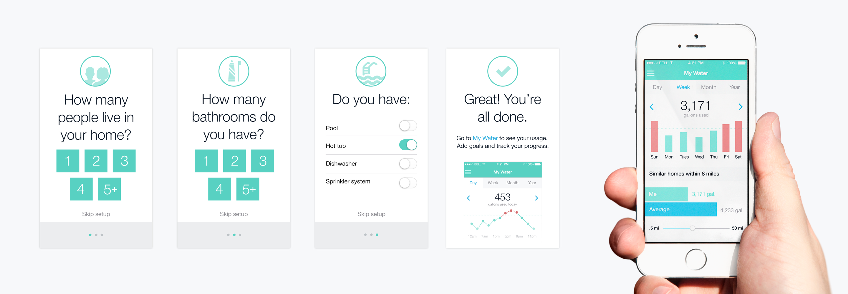
Dropcountr is an app that partners with utility companies to give customers instant feedback on how much water they are using and ways to use less. In addition to building a beautiful brand, I was the product design lead. During my time there I worked one on one with the CEO and CTO to build a product that's both beautiful and helps people.
I decided to make the app stand out by displaying the data in a clean, understandable way that pares away the non-essential elements.
One of the major challenges was creating a design that was easy to implement and quickly iterate on with a small team. The differentiating feature in my mind was the data. I decided to make the app stand out by displaying the data in a clean, understandable way that pares away the non-essential elements.
Visual and Branding
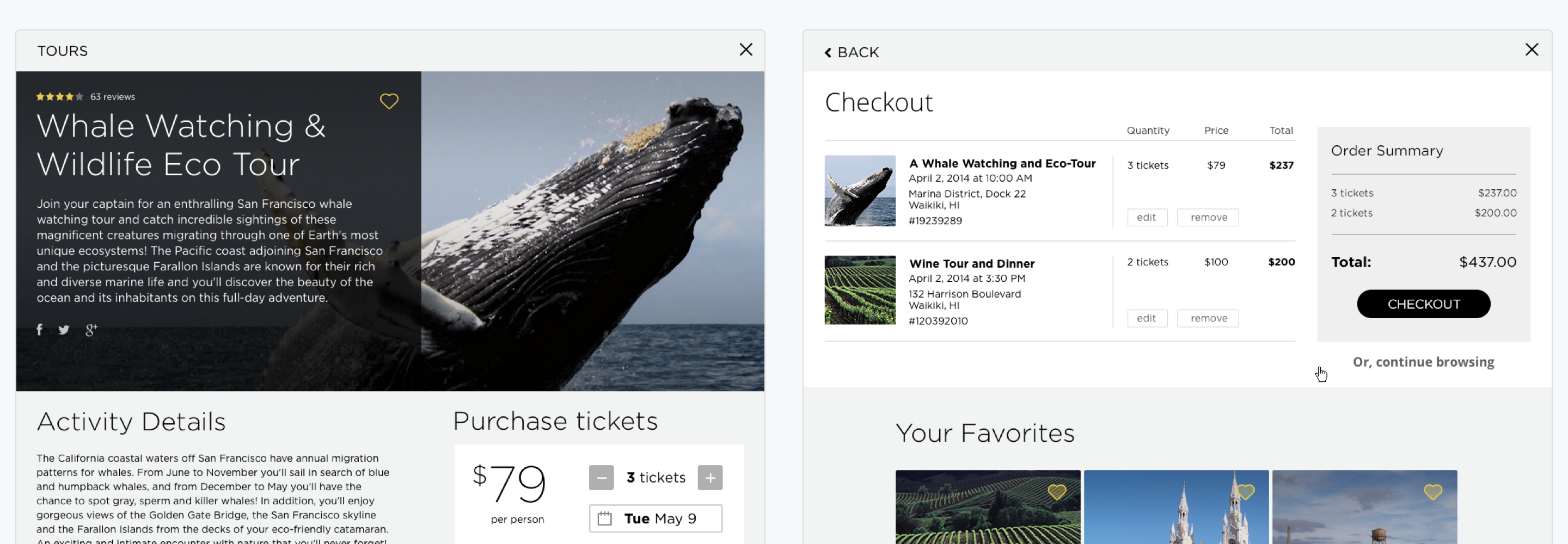
This project was a great opportunity and a lot of fun. I worked with the Destination Software team to pull Trump Hotel branding into their application. Using the Trump style guide, I visually integrated the app into the Trump website for the Waikiki and Toronto locations.
Using the Trump style guide, I visually integrated the app into the Trump Hotel websites for the Waikiki and Toronto locations.
In addition to giving the app a visual overhaul I made some UX improvements to the purchase funnel and worked with the team to ideate on future mobile features and designs. Later I worked with them on creating an email retention loop for returning customers.
Visual, Branding, and Development
Practice Fusion was a great chance to work fast and do interesting design work. During my time as principle designer, I worked with developers and other designers on multiple teams.
Health tech can be legally and technically very complex, it was always a challenge to reduce the noise and give doctors and patients the very best experience that we could create.
It was always a challenge to reduce the noise and give doctors and patients the very best experience that we could create.
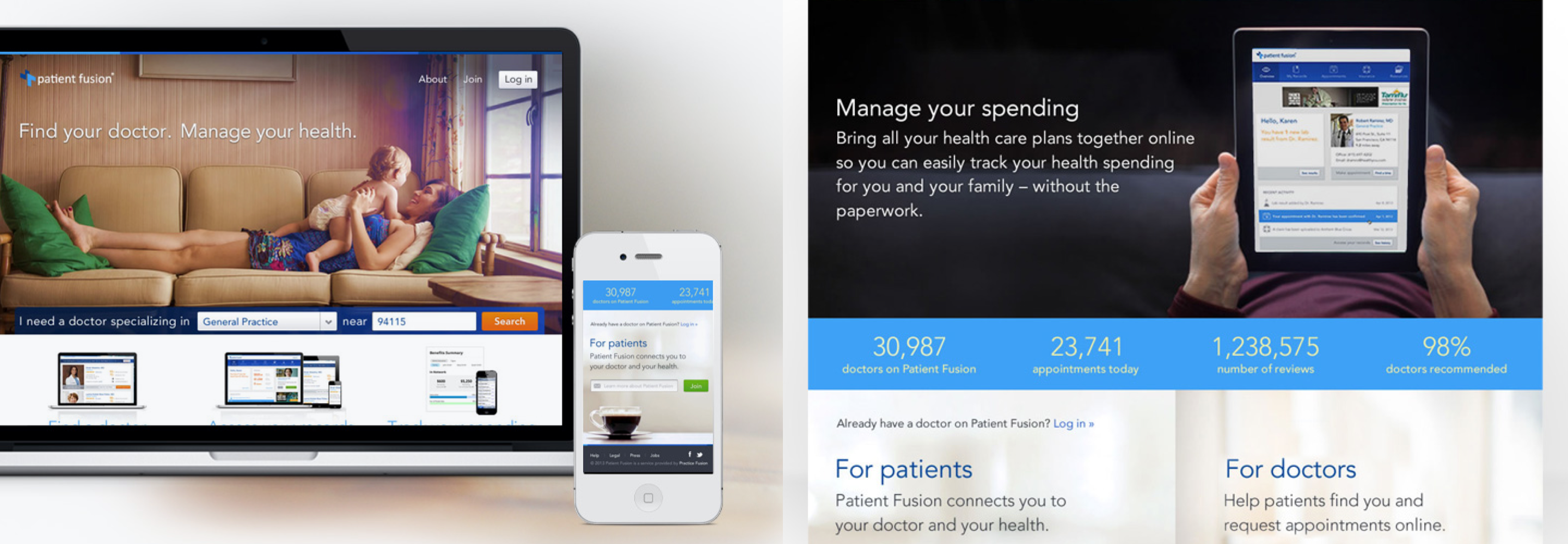
While there I worked with Cooper, a design agency, to create the product design and branding for Patient Fusion, the patient portal for the EHR. It was a great experience that really helped me solidify my design methodologies.
Visual and iOS
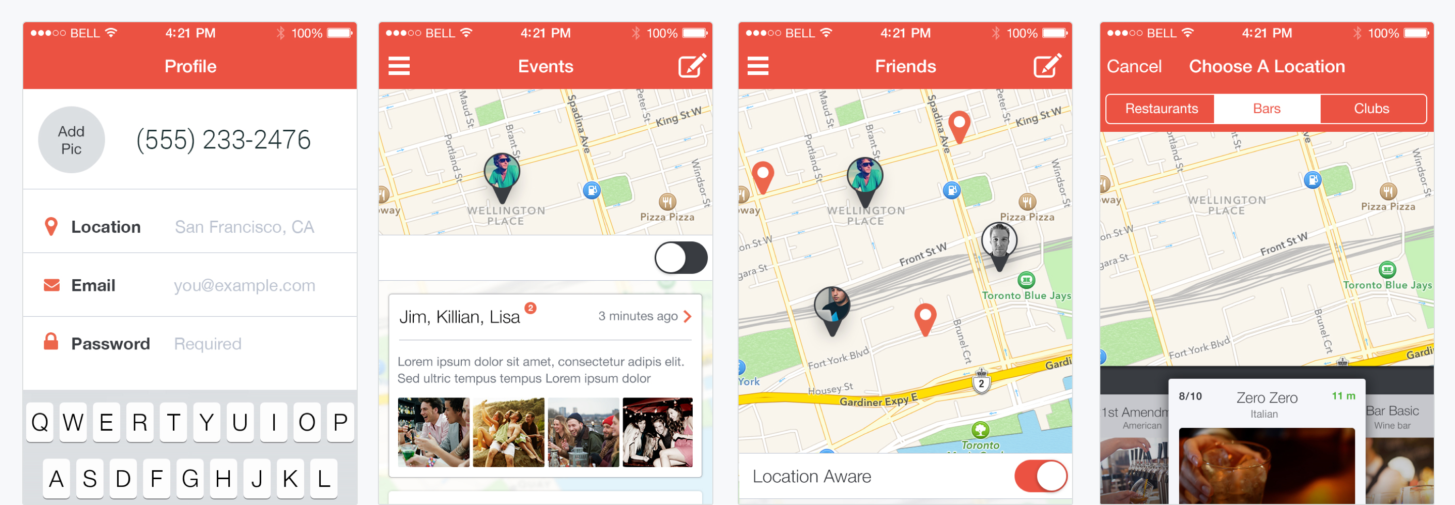
This was a quick project to add a visual layer to a pre-existing app. The app helps users find their friends in a customizable radius around their current location. It's main purpose is to connect friends who would like to meet up.
I paired the red-orange with white and light colors to make it...more readable in dark environments like bars and streets.
After a short meeting to dicuss branding, we went with a bold red-orange color. I paired it with white and light colors to make it less overwhelming and more readable in dark environments like bars and streets.
What's your story in one-sentence. I'm an East Coaster who hates winter with a penchant for all things tech, science, and design.
Describe your ideal job. I'm looking for great people. A fast paced, but not chaotic environment. A place where design is one piece of the puzzle.
Any project you're especially proud of? This one isn't in my portfolio; it's a walking tree tour brochure with a digitally painted map on the back. It was the perfect combination of design and nature, a total labor of love for me.
If you could live in any era, what would you choose? The future, as far as I could go. Imagine what people 100 years ago would think of an iPhone.
Describe a normal Sunday afternoon. Sleeping in, coffee, hiking and probably a nap if I'm honest.
Name your favorite drink. I love a great beer. The best cocktail is the Little Bee at Rye.
What's your favorite board game? Incan Gold for simplicity and action. Dominion for the replayability and fun.
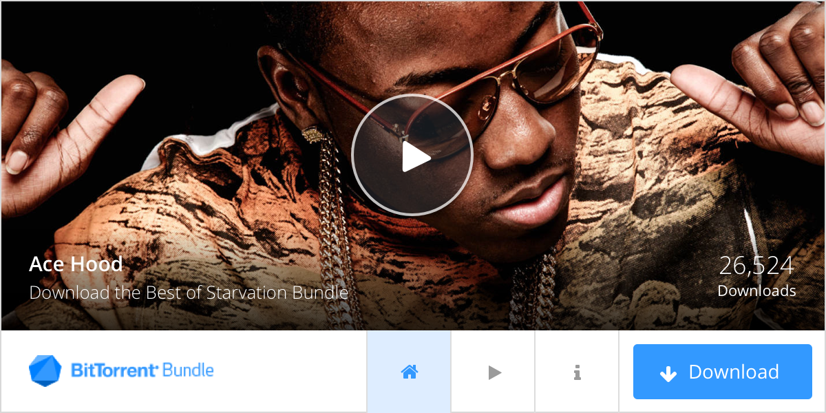
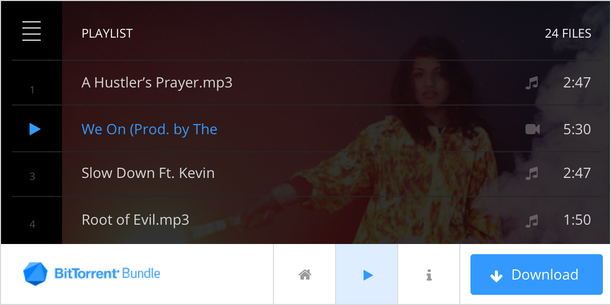
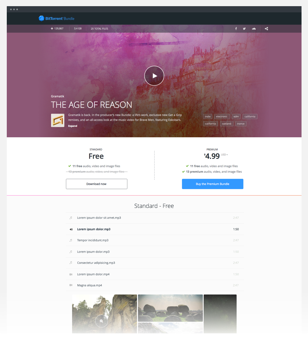
Conceptually, Bundles are a way for people to package any type and number of files into one downloadable torrent. When I came on to the project there were a few Bundles already made and the start of a brand. It was primarily a palette of black with a bright blue accent and full-screen background images.
The dark colors were interesting, so I preserved that facet by creating a palette of dark blue-grays. I chose clean white backgrounds and lots of space to improve the readability of the individual landing pages. The biggest change was choosing a new font that was cleaner and more elegant to lend credibilty and legitimacy to the Bundles.
New index page with featured Bundle
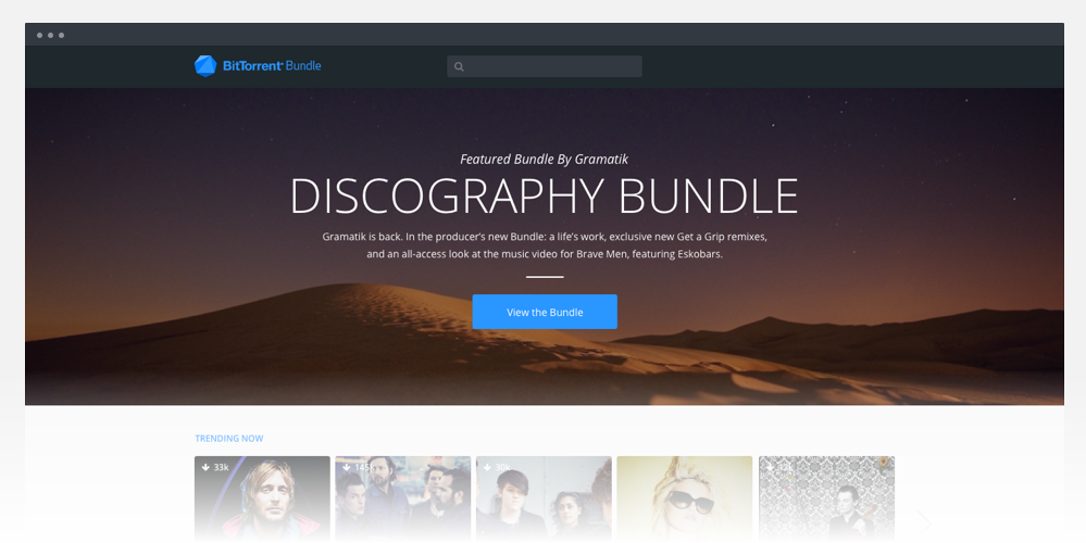
I was impressed with the quality of the background images that users were uploading; I decided to feature them in a prominent way. Through user testing, I focused in on the right font-sizes and colors that helped people browse the content, while still feeling modern and fresh.
The key brand attributes were: edgy, modern, and clean. I interpreted these attributes by building a system of high contrast color combinations, flat-styled inputs and sleek interactions.
A system of high contrast color combinations, flat-styled inputs and sleek interactions
One of the challenges with creating a visual language system was the wide degree of tolerance needed for user-generated content. This meant preserving enough space for long-titles, handling backgrounds of any quality level, and allowing customization while still preserving overall brand cohesion.
New landing page concept
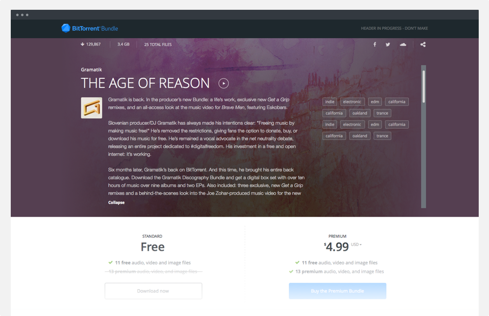
Expanded view
Old landing page and index page
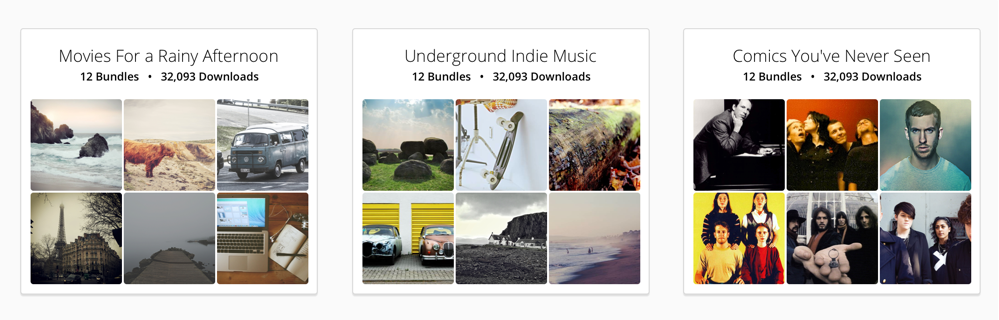
A major focus was providing high-quality search results and combining Bundles in interesting, unexpected ways. During publisher interviews I heard how limiting iTunes tagging was. We decided to allow any tags, but suggest popular ones. We also came up with a great way of combining long-tail terms to create larger, more specific categories (bottom).
I used a more square aspect ratio to reinforce the idea of music and streaming.
The concept of the cover art is used extensively throughout the site on all of the search results or browsing pages. I used a square aspect ratio to reinforce the idea of an album art (left). There is a similar style in the publish tool with an added dropdown menu (right).
Consumer-facing versus publisher-facing views
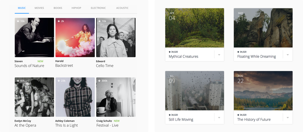
Categories of combined tags
I was really excited to work on an embeddable Bundle that anyone could copy and paste on to their site. Users would be able to download and stream directly from the widget. Essentially, it was a Bundle landing page encapsulated within a smaller space.
I wanted the essential nature of the brand language to be apparent, but we had to build something that would fit within the context of any site. I opted for IAB standard size and a series of neutral colors that could easily be customized later into themes.
Essentially, it was a Bundle landing page encapsulated within a smaller space.
Embeddable widget